Project Overview
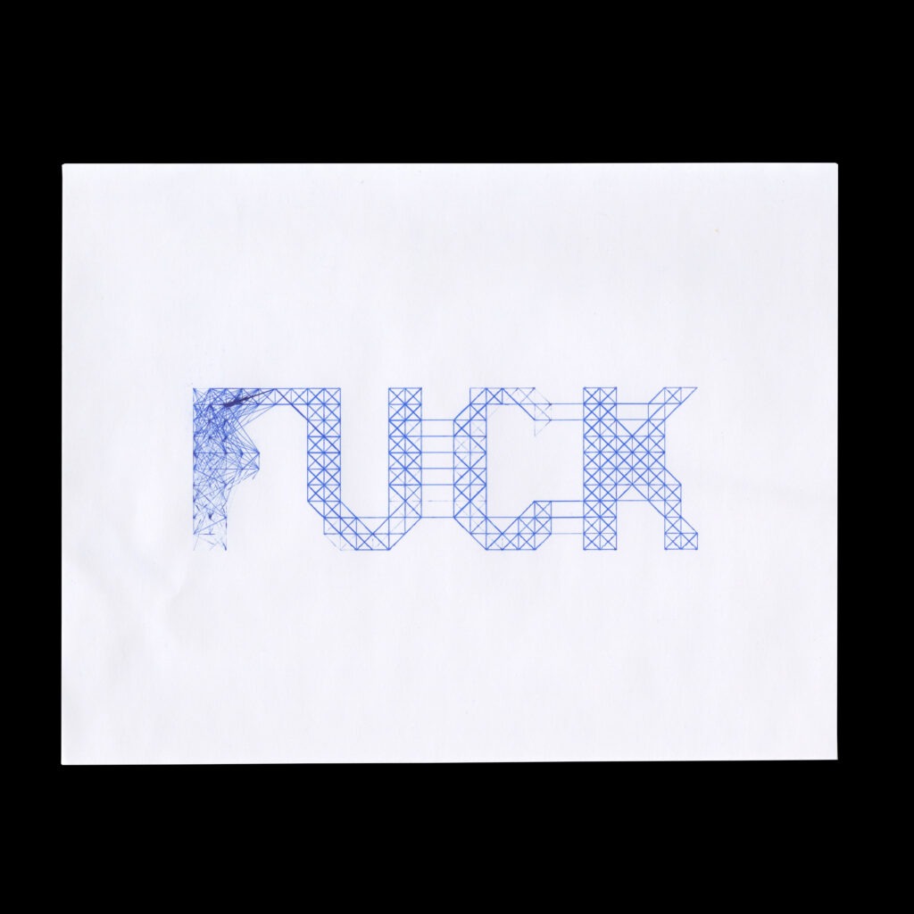
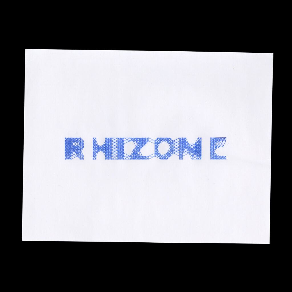
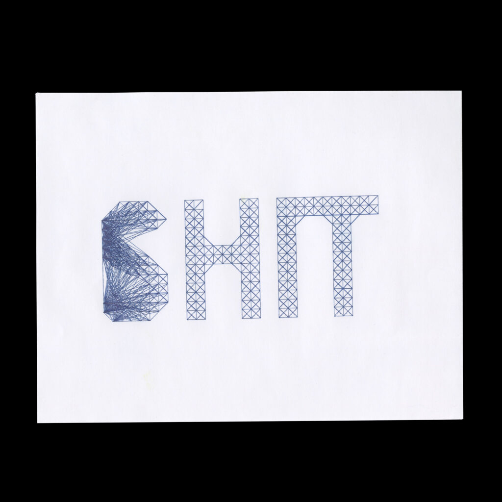
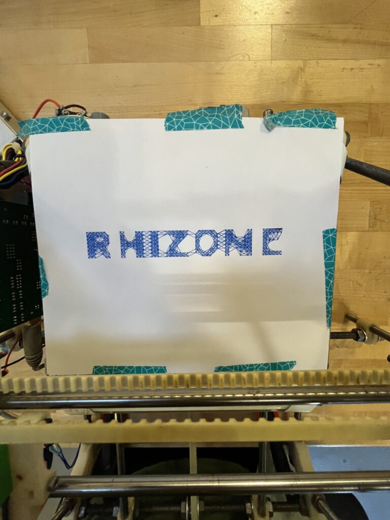
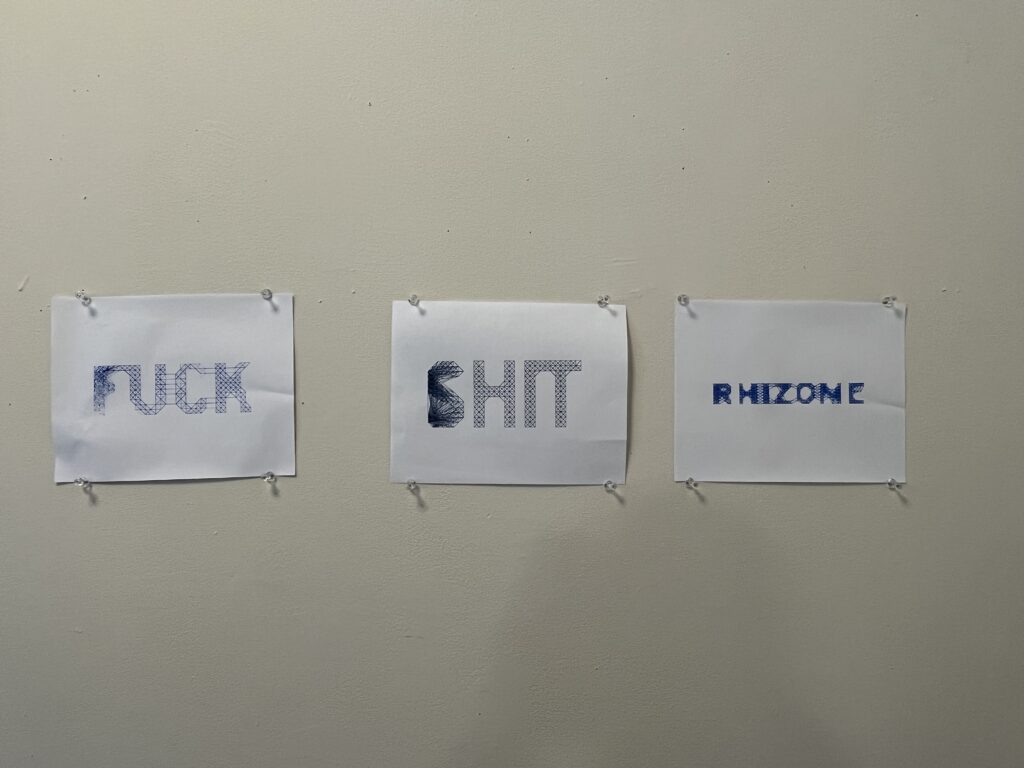
I knew I wanted to figure out a way to apply this technology to graphic design, and specifically typography. I chose “Interstate” as a typeface. As it is based on highway signage, it is a very legible typeface to begin with. I was really interested in seeing if I could replicate something close to Ben Barry’s work at Facebook. As I made progress in my definition, I realized I favored a stricter grid result. The words I chose came from trying to express my interest in this technology, while also being a bit goofy with it. I kind of knew this process would test me, so including something funny for me, helped my patience.
Process
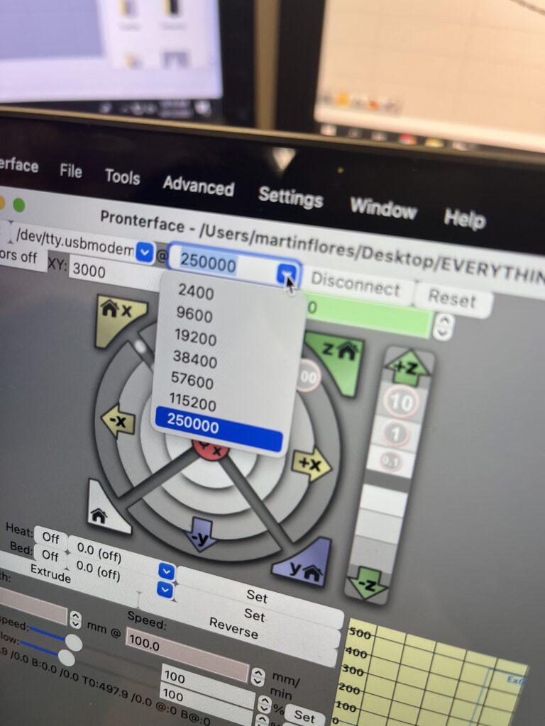
The process had moments of speed and periods of troubleshooting. As I struggled with the plotter and grasshopper, I started to understand them more bit by bit. Troubleshooting is difficult, but your brain starts to realize how much you can fix if you have no one else to depend on.
Some difficulties I faced and overcame:
-Understanding data trees and matching data strands together.
-Not home-ing the plotter device made things go haywire.
-Trying to level the printer physically after making sure everything digitally was running properly.


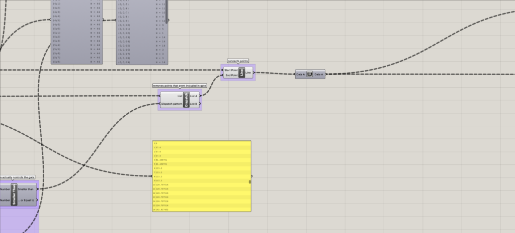
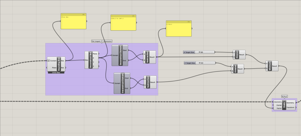
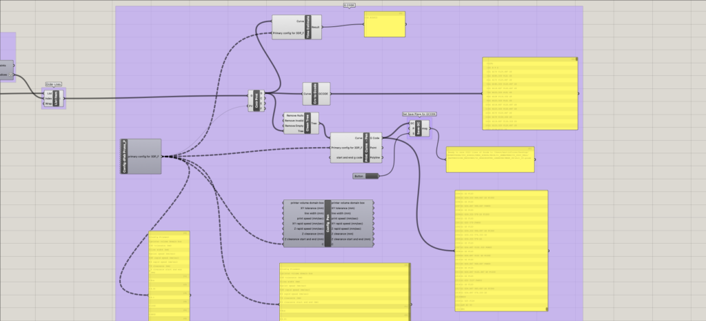
Definition screenshots: I had trouble exporting a high-res image of the entire definition. Also, it was very wide in pixel dimensions.


Files
I attempted to upload my .GH file here, but I got an error message.